Modern news and magazine websites compete for attention the moment a visitor lands on the homepage. Headlines matter, but how headlines are presented often determines whether users stay or scroll away. One design pattern that continues to work well for editorial platforms is the Bootstrap news carousel.
When implemented correctly, a carousel does more than slide content. It becomes a visual entry point that highlights important stories, organizes news in grids, and improves content discovery without overwhelming readers.
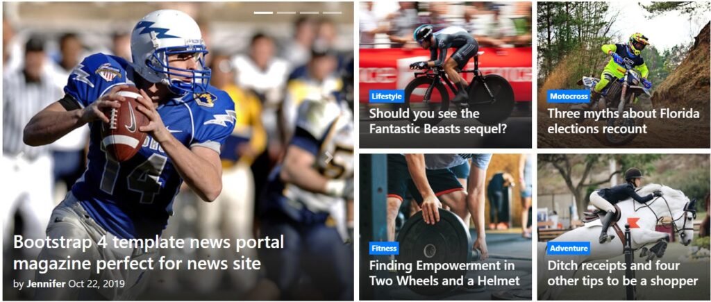
This article explains what a Bootstrap news magazine carousel is, why grid-based carousels work especially well for news websites, and where you can find free, ready-to-use carousel snippets for your project.
What Is a Bootstrap News Carousel?
A Bootstrap carousel is a UI component that allows content to rotate horizontally or vertically within a defined container. While it is often used for hero images or promotions, in news and magazine websites it serves a different purpose.
Instead of single images, a news carousel typically contains article cards, including:
- featured images
- headlines
- categories or timestamps
- short excerpts
In editorial layouts, the carousel acts as a curated content layer rather than a decorative slider.
Why Grid-Based Carousels Work Better for News Websites
Traditional carousels show one item at a time, which can feel slow and limiting for content-heavy platforms. News readers prefer scanning multiple headlines quickly.
This is why grid-style carousels are more effective for news and magazine layouts. They combine the familiarity of a grid with the motion and prioritization of a carousel.
Grid news carousels allow websites to:
- display multiple stories per slide
- maintain strong visual hierarchy
- highlight breaking or featured content
- save vertical space on the homepage
For Bootstrap-based websites, this approach fits naturally with the grid system and responsive breakpoints.
When to Use a News Carousel (and When Not To)
Carousels are most effective when used intentionally.
They work well for:
- featured or editor’s picks sections
- trending or popular news blocks
- category highlights (technology, lifestyle, politics)
- magazine-style homepages
They are less suitable for:
- long article pages
- breaking news feeds requiring constant updates
- critical announcements that must be seen immediately
In news design, carousels should support discovery, not replace standard content listings.
Key Design Principles for News Carousels
A successful news carousel follows editorial logic, not marketing logic.
First, motion should be subtle. Fast or auto-playing sliders can distract readers. Allowing manual navigation often improves usability.
Second, headlines must remain readable. Strong contrast, consistent font sizing, and sufficient spacing are essential.
Third, the carousel should feel like part of the layout, not an isolated widget. Bootstrap grids make this integration easier by aligning cards with the rest of the page structure.
Free Bootstrap News Carousel Snippets You Can Use
If you are building a news or magazine website and want a ready-made solution, there are several free Bootstrap carousel snippets designed specifically for editorial use.
Here are some useful examples:
1. Bootstrap News Grid Carousel
This snippet demonstrates a clean grid-based carousel layout suitable for magazine homepages. It shows multiple news cards per slide, making it ideal for featured stories.
👉 https://bootsnipp.com/snippets/1d3X9
2. Bootstrap Magazine Carousel by Aribudin
Designed with news websites in mind, this snippet focuses on card-based layouts and responsive behavior across devices. It works well for both blogs and news portals.
👉 https://bootsnipp.com/aribudin/snippets/8qME3
3. Responsive News Carousel Grid
This snippet emphasizes responsiveness and visual balance, making it suitable for modern Bootstrap news templates that prioritize mobile-first design.
👉 https://bootsnipp.com/aribudin/snippets/Glrry
Each of these snippets can be customized further by adjusting grid columns, breakpoints, or animation behavior to match your site’s editorial style.
Integrating Carousels into News and Magazine Layouts
When integrating a carousel into a Bootstrap news template, placement matters.
The most effective positions are:
- below the main headline section
- between major homepage sections
- as a category highlight block
Avoid placing carousels too deep into the page where they lose visibility. At the same time, avoid stacking multiple carousels back-to-back, which can overwhelm readers.
A single, well-designed carousel often performs better than several competing ones.
Performance and Accessibility Considerations
Carousels can impact performance if not optimized. Image sizes, JavaScript behavior, and animation timing all matter.
For news websites, performance should always come first. Lazy-loading images and limiting animation complexity help keep pages fast.
Accessibility is equally important. Carousels should support keyboard navigation and avoid auto-play behavior that cannot be paused. Readers should always feel in control.
Carousel as an Editorial Tool, Not a Gimmick
On news and magazine websites, design elements must serve editorial goals. A carousel should help readers discover important stories, not distract them with unnecessary motion.
When paired with Bootstrap’s grid system, news carousels become powerful tools for structuring content, highlighting priority articles, and improving homepage engagement.
Used thoughtfully, a free Bootstrap news magazine carousel can elevate the presentation of your content without sacrificing clarity or performance.
Final Thoughts
Bootstrap news carousels work best when they respect how people read news. Grid-based layouts allow quick scanning, while subtle interaction keeps the experience focused.
With free, well-structured snippets available, implementing a professional-looking news carousel no longer requires complex development. The key is choosing a design that aligns with your editorial strategy — and remembering that in news design, clarity always beats animation.